

Streamline your WordPress workflow with 5 simple, plugin-free strategies to speed up your blogging process and eliminate those repetitive tasks.
We’ve all been there—uploading, resizing, rewording, and adding the same HTML over and over. Sound familiar?
That used to be me too. Until I realized: I didn’t need another plugin. I needed a better process.
As a blogger/writer/content creator (whatever title fits), I hit a tipping point. Every post started with good intentions and ended in tab fatigue and copy-paste déjà vu.
For clarity, I’m talking about the publishing process I use on a separate site — a niche affiliate project I run on the side. It’s one I enjoy building, and it keeps my WordPress skills sharp. (Just in case you’re looking at this site thinking, “He doesn’t post enough here to need a full-blown workflow.”)
So, I developed my own mini-system—five repeatable, no-plugin strategies that power almost every post I write or manage.
This isn’t about automation for automation’s sake. It’s about making what already works faster, easier, and more sustainable—so you can show up consistently with content that matters.
Table of Contents
My 5 WordPress Workflow Management Tricks to Streamline Publishing
1. Canva Templates That Save My Sanity (and My Brand)
Let me paint you a picture—literally. For the longest time, when I needed a featured image or banner for a post, I’d open Canva… stare at the blank canvas… get lost in picking a font… and 20 minutes later, have something “okay” that didn’t match my site’s vibe.
Then I realized: if I’m doing something over and over, it deserves a system. So, I created templates—two, to be exact:
- One for WordPress featured images (because that thumbnail real estate is prime).
- One for in-content images that break up big text walls or add visual punch to SEO-heavy posts.
Here’s how I use Canva for a Featured Image Workflow:
- Open my featured image template.
- Make a copy, edit the headline and photo.
- Download it as PNG.
- Convert it to WebP at freeconvert.com (because speed matters).
- Upload it to WordPress as the featured image. Done.
In-Content Image Workflow:
For more visual posts (like tutorials or roundups), I batch these:
- Open my in-content template.
- Make a copy → CTRL+A to clear → reuse the layout with new images/text.
- Add a new page or duplicate the previous one for each graphic.
- Download the batch, with keyphrases in the file names (SEO wizardry✨).
- Convert everything to WebP with freeconvert.
- Bulk upload to WP Media Library.
- Drop each into the content where I’ve already marked a handy [PLACEHOLDER FOR IMAGE NAME].
No more scrolling back to figure out fonts or sizing. Everything’s on-brand and ready to publish.
Canva’s Brand Kit = My Secret Sauce
Even without my logo, the Brand Kit keeps everything cohesive. My color palette and fonts are locked in, so no more font roulette. It’s like having a personal designer who just gets me.
Client Corner:
I use this same system for client blogs too. If you’re managing multiple contributors, launching a new brand, or tired of messy image workflows, templates can keep your editorial calendar on track and your brand consistent—without the chaos. New site? No problem. I build the templates around your layout and color palette.
If that’s something you’d be interested in, contact me here.
📏 Bonus Tip: Match Your Image Size to Your Theme
Before you download random “recommended” image sizes, try this:
Using the Chrome browser → Right-click an image on your site → click “Inspect” → hover over the image. Chrome will show you the size.
If your theme only shows the image at 794px, don’t upload a 1200px image. That’s just wasting bandwidth and slowing things down. Make the image the exact size you need in WebP format, and your site will load easier. Watch your PageSpeed Insights improve.
2. Affiliate Disclosure Statement Example (That Doesn’t Kill the Vibe)
Affiliate disclosures don’t have to be a boring legal speed bump—they can actually help build trust if you write them like a human.
Most affiliate programs (looking at you, Amazon) give you a generic template to throw onto your site. And sure, it’s better than nothing, but those copy-paste statements often come off as stiff, robotic, or completely disconnected from the rest of your content.
- ✔️ I make my affiliate disclosure feel intentional, transparent, and on-brand.
- ✔️ It usually lives just below the table of contents — seen before any real content kicks off.
- ➡️ That’s my go-to for “Best X for Y” posts — the money pages.
- ➡️ For informational posts, I drop the disclaimer in the section with affiliate links.
- ➡️ Some networks (like Impact Radius or Commission Junction) require above-the-fold placement — in those cases, I follow suit.
- ✔️ It’s styled to stand out visually while still blending with my site’s design.
- ✔️ It links to my mission statement page, showing the “why” behind the blog.
- ✔️ And most importantly, it’s written like me — casual, honest, and upfront.
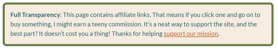
Here’s the exact HTML I use:
<div style="background-color: #F5ECE1; color: #2A5D67; border: 6px solid #6A7D49; border-radius: 10px; padding: 15px; margin: 10px auto; font-family: 'Lato', sans-serif; font-weight: normal; font-size: 17px; max-width: 1200px; width: 100%; line-height: 1.5; display: block;">

    <strong>Full Transparency</strong>: This page contains affiliate links. That means if you click one and go on to buy something, I might earn a teeny commission. It’s a neat way to support the site, and the best part? It doesn’t cost you a thing! Thanks for helping  <a href="https://yoursite.com/vision-statement/" target="_blank" style="color: #C46228; text-decoration: underline;">support our mission</a>.

</div>
It’s not just a legal formality—it’s a small, stylish reminder that:
- I earn a commission only if you choose to buy through a link.
- It costs you nothing extra.
- Your support directly fuels an educational mission.
✨ Why this matters (especially for your site):
If you’re building a blog with purpose, personality, and a point of view (not just a content mill), don’t let your affiliate disclosure sound like a robot wrote it. Speak in your voice, show what the revenue supports, and make it part of the experience—not a clunky aside.
And hey — it’s totally fine to say the revenue helps you keep doing what you’re doing. Think of YouTubers: they’ll often say, “If you liked this video, help support our channel by liking, subscribing, or sharing.” That kind of support message has become second nature to most viewers.
But here’s the distinction: that line only applies to the ad revenue creators earn from YouTube itself. Once they start sharing affiliate links, FTC guidelines come into play. If you’re earning a commission, you’ve got to be upfront about it. The key? Keep it human, but crystal clear.
Bonus SEO Tip: Don’t Let the Disclosure Steal Your Meta Description
One reason I don’t open a post with the disclosure? If I forget to write a custom meta description (guilty 🙋♀️), Google often pulls the first 160 characters.
If that’s “This page contains affiliate links…” — that’s what shows up in search results. Not exactly click-worthy.
By placing the disclosure right after the table of contents, it’s early enough to meet compliance (before any links appear), but far enough down to let my intro do its job. I want the first lines Google (and readers) see to be compelling and relevant—not legal-speak.
3. Lightweight YouTube Embeds With a Video Facade
Ever notice how embedding a YouTube video on WordPress can feel like convincing a cat to take a bath. It’s frustrating—and just a little traumatic.
Default embeds bring in a ton of extra code and tracking scripts—not ideal if you care about site speed or Core Web Vitals (which… you should).
Instead, I use what I call a video facade: a clickable image that only loads the actual video when the user interacts with it. This keeps things fast, tidy, and still user-friendly.
My Process: Set Once, Reuse Forever
I keep the HTML in a draft post—labeled clearly—so it’s always one copy-paste away. The only two things I swap out:
- The image thumbnail URL
- The YouTube embed link
Here’s the full code I use:
<div class="video-facade" style="position:relative; width:100%; max-width:800px; height:0; padding-bottom:56.25%; overflow:hidden; cursor:pointer;">

    <img class="thumbnail" src="https://yoursite.com/wp-content/uploads/2025/04/image-name.webp" alt="YouTube Video Thumbnail" style="width:100%; height:100%; position:absolute; top:0; left:0; object-fit:cover;">

</div>

<script>

document.addEventListener('DOMContentLoaded', function () {

    document.querySelector('.video-facade').addEventListener('click', function () {

        if (this.querySelector('iframe')) return;

        var iframe = document.createElement('iframe');

        iframe.style.position = 'absolute';

        iframe.style.top = '0';

        iframe.style.left = '0';

        iframe.style.width = '100%';

        iframe.style.height = '100%';

        iframe.src = 'https://www.youtube.com/embed/codehere?si=bEu-ARucWVPZMvSW&autoplay=1&rel=0';

        iframe.frameBorder = '0';

        iframe.allow = 'autoplay; encrypted-media; fullscreen';

        iframe.allowFullscreen = true;

        this.innerHTML = '';

        this.appendChild(iframe);

    });

});

</script>
How I Grab the Thumbnail
No tools needed. Just:
- Right-click the YouTube video.
- View Page Source.
- CTRL + F for “maxresdefault.jpg” — most YouTube videos have this high-res thumbnail, especially if a custom one was uploaded.
… If it’s missing, look for “hqdefault.jpg” instead — that’s the standard thumbnail and it’s always available. - Copy the link and save the image.
- Upload it to Canva to add a play button overlay (so users know it’s a video, not just a static image).
- Resize if needed, then convert it to .webp using freeconvert.com.
- Upload it to WordPress.
- Copy the file URL, paste it into the code, replacing the old image, and swap out the YouTube embed URL. Boom.
Why It’s Worth It
- Better page speed: No third-party scripts until they’re needed.
- Cleaner design: Matches the flow of your post instead of sticking out.
- Clickable previews: The play button overlay makes it obvious it’s a video.
A little effort upfront, and your videos become faster, cleaner, and more engaging—every time.
4. Product Recommendations That Actually Look Good on Mobile
Let’s be honest—most Amazon affiliate blocks look like they fell out of 2008.
Before I built my own reusable code, I’d rely on Amazon’s built-in “Site Stripe” (meh), or try to finesse my own layout—only to discover it looked fine on desktop but completely broke on mobile. And what’s the point of recommending a product if no one can read your bullet points without zooming in?
Discover the Mobile-Friendly Affiliate Block Template
I designed this layout to be clean, centered, and fully stacked for mobile. No weird image-text wrapping. No surprise layout glitches. And no plugins involved. Just good ol’ HTML and CSS.
Here’s the reusable code I keep tucked away in my draft template post:
<div style="display: flex; flex-direction: column; align-items: center; border: 2px solid #ddd; border-radius: 10px; padding: 15px; max-width: 950px; background-color: #f9f9f9; box-shadow: 2px 2px 10px rgba(0, 0, 0, 0.1);">

  <!-- Make image clickable by wrapping it with an anchor tag -->

  <a href="https://amzn.to/productID" target="_blank">

    <img src="https://m.media-amazon.com/images/I/imagelink._AC_SX300_.jpg" alt="Product Name" style="width: 100%; max-width: 300px; border-radius: 5px; margin-bottom: 15px;" loading="lazy">

  </a>

  <!-- List of bullet points -->

  <ul style="list-style-type: none; padding: 0;">

    <li style="font-size: 16px; margin: 5px 0; color: #555;">?? <b>Benefit 1 –</b> description.</li>

    <li style="font-size: 16px; margin: 5px 0; color: #555;">?? <b>Benefit 2</b> – Next description</li>

    <li style="font-size: 16px; margin: 5px 0; color: #555;">?? <b>Benefit 3 –</b> Next description.</li>

  </ul>

  <!-- Amazon link button -->

  <a href="https://amzn.to/associateID" style="display: inline-block; background-color: #ff9900; color: white; padding: 10px 15px; text-decoration: none; font-weight: bold; border-radius: 5px; margin-top: 15px;" target="_blank">Check Price on Amazon</a>

</div>
Hotlinking Amazon Images (Yes, It’s Okay — With Rules)
This isn’t about downloading and reuploading the image (which is a no-go under Amazon’s terms — see section 6a).
But hotlinking—embedding their hosted image via the direct .jpg URL—is totally fine as long as you’re linking to Amazon with your affiliate ID.
How to grab a product image:
- Right-click the product image on Amazon
- Select “Copy image address”
- Change the suffix to ._AC_SX300_.jpg for a crisp, consistent size
That little suffix is part of Amazon’s CDN and controls dimensions. Tidy trick, right?
Why Template It?
- No more re-fighting the mobile layout war every time
- Your product blocks stay on-brand and cohesive
- It’s quick: swap image, bullets, and links—done
- Keeps your layout consistent across posts (and even full series)
5. Finishing Touches That Strengthen SEO + UX
This last step isn’t flashy — but it’s the glue that holds your whole workflow together. It’s also the part most people skip.
✏️ Proofreading With the Reader in Mind
When you’re reviewing your draft, it’s not just about typos — it’s about trust.
Ask yourself:
“Would I believe this if I were new to the topic?”
If the answer’s “eh, not fully,” drop in an external link to a credible, ad-free source — like a vet, doctor, university, or solid nonprofit guide.
You’re not flexing. You’re building confidence.
🔗 Internal Linking That Feels Natural
Forget jamming in links for the sake of SEO. Instead, reverse-search your own content:
- Use WordPress search in the dashboard
- Or go full nerd with: site:yourdomain.com [topic] on Google
You’re hunting for relevance. Context. Genuine value.
Internal links aren’t just for bots — they’re for guiding your readers to the good stuff, without making them guess what to click next.
🏷️ Tagging With a Strategy (Not a Scattergun)
Random tags? Nah.
I keep a swipe file of 70+ curated tags, built up over time.
Before publishing, I ask ChatGPT to pick 5–10 hyper-relevant ones based on the post.
This keeps tag archive pages clean, focused, and actually helpful — not just a junk drawer of keywords.
Wrapping It Up: Templates Today, Time Saved Tomorrow
To recap, here are five things I do now that I didn’t before:
✅ Create image templates in Canva with my brand kit, locked-in sizes, and a smooth download/export flow.
✅ Use a styled HTML block for affiliate disclosures that’s honest, on-brand, and non-cringe.
✅ Add lightweight YouTube facades with custom thumbnails, so visitors stay on-site (not off watching skateboarding parrots).
✅ Display Amazon products in a polished, mobile-friendly layout I can drop in, tweak, and reuse.
✅ Pull tags from a curated swipe file and let AI help surface the most relevant ones — so my content stays connected and discoverable.
None of this is complicated — and that’s the point.
These tweaks came from watching how seasoned bloggers, especially those juggling high-volume WordPress sites (some earning six figures), keep things flowing without reinventing the wheel.
Simple systems scale. That’s the real secret.
If any of this had you thinking, “Yeah… I need this kinda workflow in my life,” you’re not alone.
I didn’t invent these ideas in a vacuum. A lot of them were shaped by trial, error, and quietly learning from how other pros run things behind the scenes.
There’s a space I tap into for that — a behind-the-curtain hub where all kinds of indie site builders share what’s actually working. It’s equal parts knowledge base, workflow lab, and watercooler for folks building content-driven sites without a full team behind them.
Because let’s be real — you can’t exactly talk to your niche audience about your publishing pain points.
If you’re into that kind of nerdy-but-practical thing too, join me and others here from around the globe for real-time discussions anytime. It’s always office hours somewhere.
Anyone building a business on a “Powered By WordPress” website, ought to be in this group!
What’s one part of your WordPress workflow you wish you could streamline?
Drop a comment below — I’d love to hear what’s working for you or what repetitive task you’re dying to ditch.